Who really owns your design, ideas & code? Key tips while negotiating a contract in Canada
Free alternative to shutting down Email Oracle
Be your own stock photograher
The importance of a single inbox
Bergbaumuseum - Corporate Design for five museums
Generalist vs. Specialist
Video Series for Window installation products
Facebook Pages instead of a Website?
Pircher Catalog – Inspiring garden furniture
Did webdesign kill the print design star?
Corporate Design Yoga Shiatsu Zentrum Meran
A bridge in the sky
Ewo technical catalog
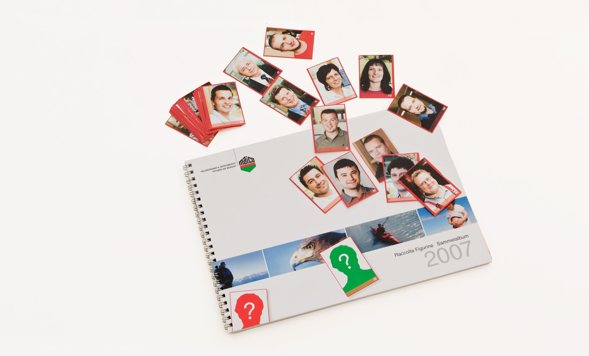
Award winning internal branding campaign
Award winning inhouse awareness campaign. Pannini style collectible stickers of employees and company core values which had to be collected into an album, helped bridge the gap between warehouse and office departments. Employees had to exchange stickers to complete the album and where rewarded with a valuable gift.
Relaunch of my Portfolio site - part 2. The relaunch of the relaunch
You shall not overbrand
New Google Feedburner UI spotted - a quick overview
Feedburner is a service for webmasters and website owners to track their RSS-Feed subscribers and much more. RSS did not make it to the general public as everyone hoped, but still are very important. Google bought the company behind Feedburner a couple of years ago and beyond a small integration into Google Analytics and Google Adsense nothing happened for years. Today I spotted the "Try the new beta" and here are some screenshots of the interface.
The new Dashboard features messages, your top items and top feeds.
The Feed list features a neat little graph of your reach. Note if you have more clicks than views you are using your rss feed on Twitter or Facebook.
The Feed overview is very well structured and gives you the ability to hide values from the chart. At the moment if you select all time in the date selector it shows only the last two month - I hope they will import the old data over from the classic Interface. But it's proof that they build it from scratch since they clearly have a new database as source.
The single Item display does not show much - but I'm sure they will improve this.
The Subscriber overview has just got more colorful, nothing special I can see here.
This on the other side is interesting. It shows you the endpoints (formerly known as "USE") where your items have been shown and clicked. It would be great if you could reach out to the url shorteners and import their data as well to see effective endpoints even for shortened urls.
All in all it loads quite fast and works well. It gives me a better overview and maybe I start to analyze my feed stats again.
Südtirolski.com
How to show silence
Objective
How to show the advantages of a doorstep insulation? How to make the customer understand how much a reduction of -54 dB is?
Solution
Easy - take real world noises and reduce them in the Soundeditor by 54 dB. It was realized for the Tecnogramma Audio Podcast and reused with a slideshow on the website. Here the video for your enjoyment.


