Finding relevant apps in the Google Play Store can be difficult. There is no real personalized recommendation in place and most App Recommendation Apps are based on chart positioning and downloads alone.
Here comes Paco - the first installment of a personalized recommendation app. Paco presents new apps that fit you because it analyzes the installed apps and your app usage. Every two hours you get 5 high quality apps that users with similar app profiles have. This allows the user of Paco to discover apps that might not be in any top chart, but still are relevant and useful. This happens all anonymously and the privacy of the user is save.
I had the opportunity to help design this App and shape the product features as well as art direct the character design and copy text.
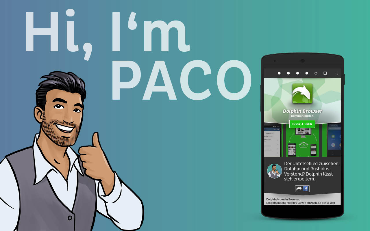
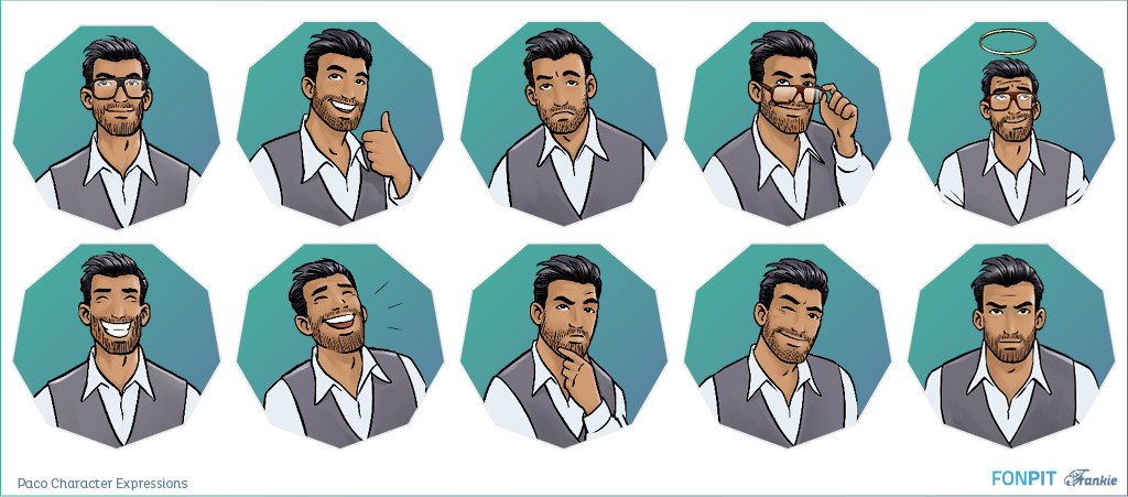
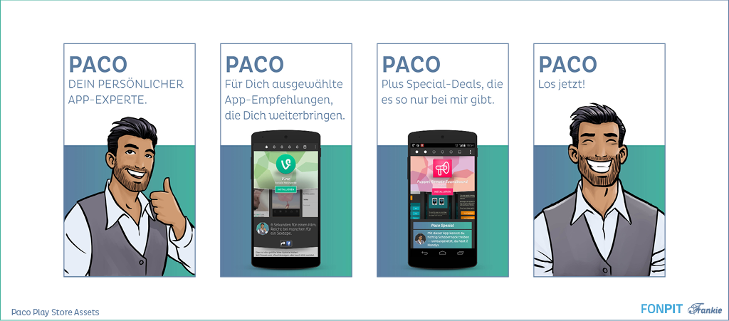
Paco has character
A distinctive feature of Paco is it's character. We created the story of the character first and then illustrated him. The design is centered around Paco as a character, he is not just a mere mascot in the app. He is portrayed as an App Expert who has built this app not only to help users find the right app, but also to express his opinion about the apps.
In fact, the most popular apps have witty app descriptions written by a comedian who impersonates Paco. All user interface texts are in the right tone for Paco - written in a way to be fresh and funny.
This was made as an effort to target a wider audience of non geeks that want to enjoy using an app - even if the main purpose is something utilitarian. But it also meant that we launched Paco only in Germany for the time being to guarantee the quality of the content.
The Paco App
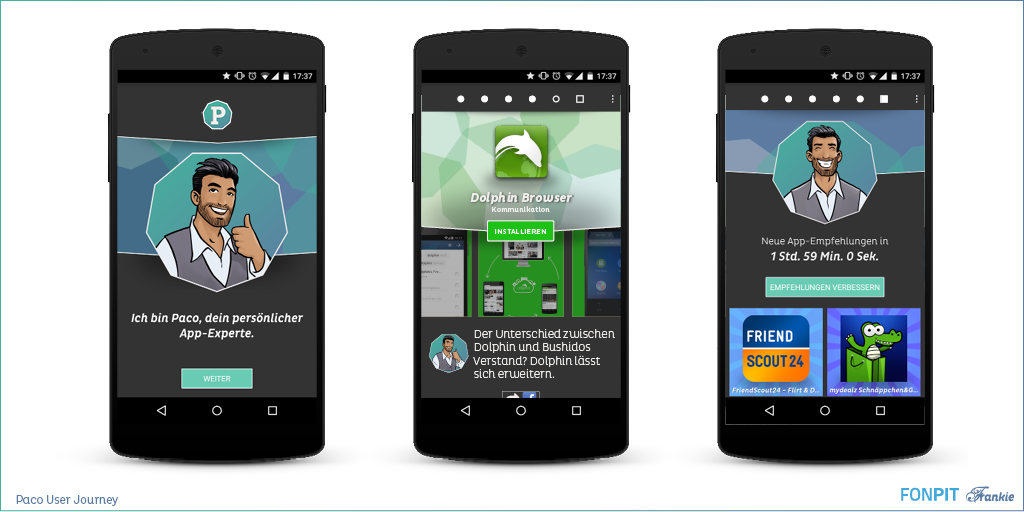
The Paco Android App was designed to be a fun experience where the Paco Character could guide users and present the apps in a innovative way.
The apps are presented in packs of five and each app is shown in a way to showcase the visual aspects and the reason why Paco thinks this app is relevant or his general comment about the app. Going through the recommendations is done easily by swiping left or right and every two hours a new set of apps is ready.
Gone are specs, download stats and all the other clutter which can be seen once the user taps on the install button and gets redirected to the Google Play Store.
The official app description is present at the end of the screen so that users have a way to dig deeper if they want to. Our data shows that around 30% of users do look at the description to find out more about an app.
User tests have also shown that the simplified presentation helps in the decision process. Deciding to installing an app doesn't need all the metadata presented in the official app stores. Validation that an app is good comes from the recommendation itself. The limitation to present only five apps is also an important factor - no more getting lost in endless lists.
The Paco Brand
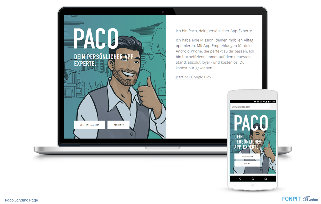
We also made sure that Paco is perceived as a complete brand. The design of the app, the Play Store Assets, the website and the social media presence are coherent and express professionalism without being boring. To achieve that we embrace the the comic look of the character and pair it with modern typography and white space for a modern and adult look.
Part of the unique design language is also using the nonagon and similar shapes to set Paco apart from the omnipresent round avatar shapes seen on the web and in apps.
Experience Paco
The combination of design, copy writing and functionality make Paco really unique at this point and I would like you to try Paco for yourself. The project has been sunset - but you can download the App by clicking on the following button (you need to have third party apps enabled)





Comments (0)