You ever wondered why some magazines appeal you more than others? One thing you rarely been teached is how to do appealing covers. Even when you are in corporate publishing and layout the corporate news magazine having a nice cover is good. Besides the text layout having an appealing foto is key. But not every photo does the same good job. Here a few examples and why they work.
Working well
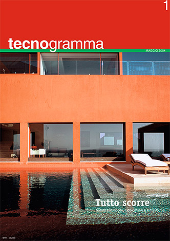 This cover works quite well. The copy and the photography are nice and complement (showing water and the title says "everything flows"). The colors harmonize and it gives the whole a high quality look.
Working better - with a human
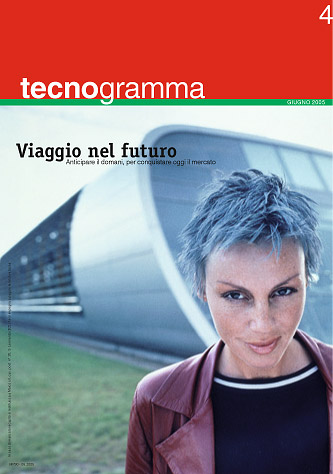
 Same as the previous the copy and concept expressed by the picture work together. But this covers has a higher appeal because there is a human being. We are hardwired to watch at other humans, so if you compare a picture with a human and one without a human the later will before appealing.
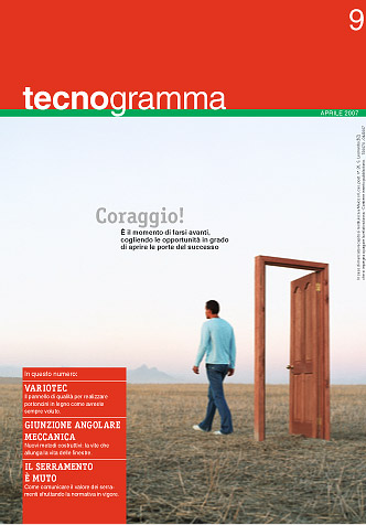
Working best - right into the eye
 To do a cover with even more appeal you have to not only show a human, but to show a human eye. Even better when the eye is in the face of a human ;-) Humans do not only seek for humans in pictures, they actually seek for the eye to make "contact" with the human portrayed. If you show a human watching in direction of the viewer this connection can be made and it is much more likely that the prospect reader will grab the magazine and have a look.
On a newsstand obviously nearly every magazine nowadays portraits humans facing the reader so the effect is minimized, but the same effect is also true for covers of brochures, web pages etc. By knowing this you can steer the concept of the cover page towards showing humans facing the reader.