
How storytelling improves corporate publishing
Why more and more companies choose to publish their own magazine is a wider topic I will cover in a future post. I will start my new series about corporate publishing by demystifying a myth - corporate publishing is boring. I will show you in this lesson how you can make a graphically stunning article about the introduction of a new window hardware product line by telling a story.
The Briefing
The goal of the article was to inform the clients of the product line - in this market new product lines come every 10 years and therefore it's big news. On the other side it was important that the client doesn't get the feeling that he has to switch to the new hardware immediately (meaning a big investment for new tools etc.) and that the existing line will continue to exist.
You see, the difficulty is to push a new product without saying "the old product is crap, get the new one".
The Idea
To make a graphically great article you have to get a good written article beforehand. If the copywriter knows how you want to "show" the reader the content of the article he can adjust the tone to get graphical interpretation and contents in harmony.
In this case we opted to split the article into a introduction part and a technical descriptive part. The basic idea for the introduction part was "alternation of generations". A kind of father and son story where the new product line was the son and the old one the father.
In the introduction the article show the reader how window hardware evolved from the medieval times until now. In the second part of the article we just made a showcase of the new hardware pointing out the new highlights without comparing it to the old one. The basic claim here was "We maintained the good stuff and added something new"
The graphical concept
In the graphical concept I thought it would be a nice setting if we let the reader explore the history just like if he was looking at the "window hardware family photo album". In a family photo album you collect memorable events and pictures of the children. In this case I combined photos of various times with pictures from the different window hardware parts.
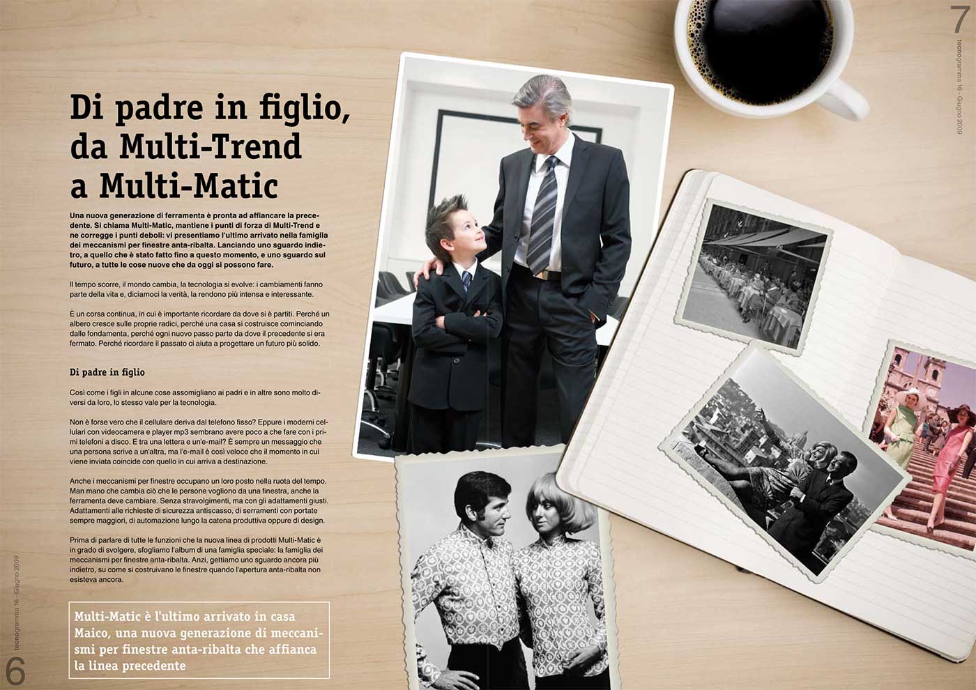
As you can see in the first spread the hardware is nowhere to see, just pictures of a father with his son and some old photos. It was important that the pictures showed only well known Italian places as the magazine aims for the Italian market. I created a real set, simulating that the photo album and the photos lie on a desk and the coffee mug give you the impression that you, the reader are sitting at the desk looking this photos.
The text talks about the new hardware, but gives much emphasis to the whole "generation" concept.
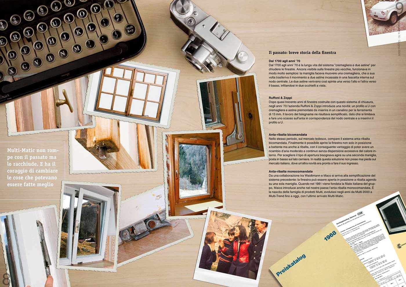
In the second spread we get more technical. The photo album is gone and there is a writing machine and an old camera along with the pictures showing some old windows and some family and car shots from the 70s. To push the concept even more the frames of the photos change with the time they represent. The older ones have the scrambled edges in the 70s they become Polaroids and later one, the just get a nice white border (as it is in fashion today). I've put also an old catalog of the company publishing this magazine because it combined two facts. First it shows the ancestor of the modern windows and with the cover you see that the company introduced this revolution in window technology in 1968.
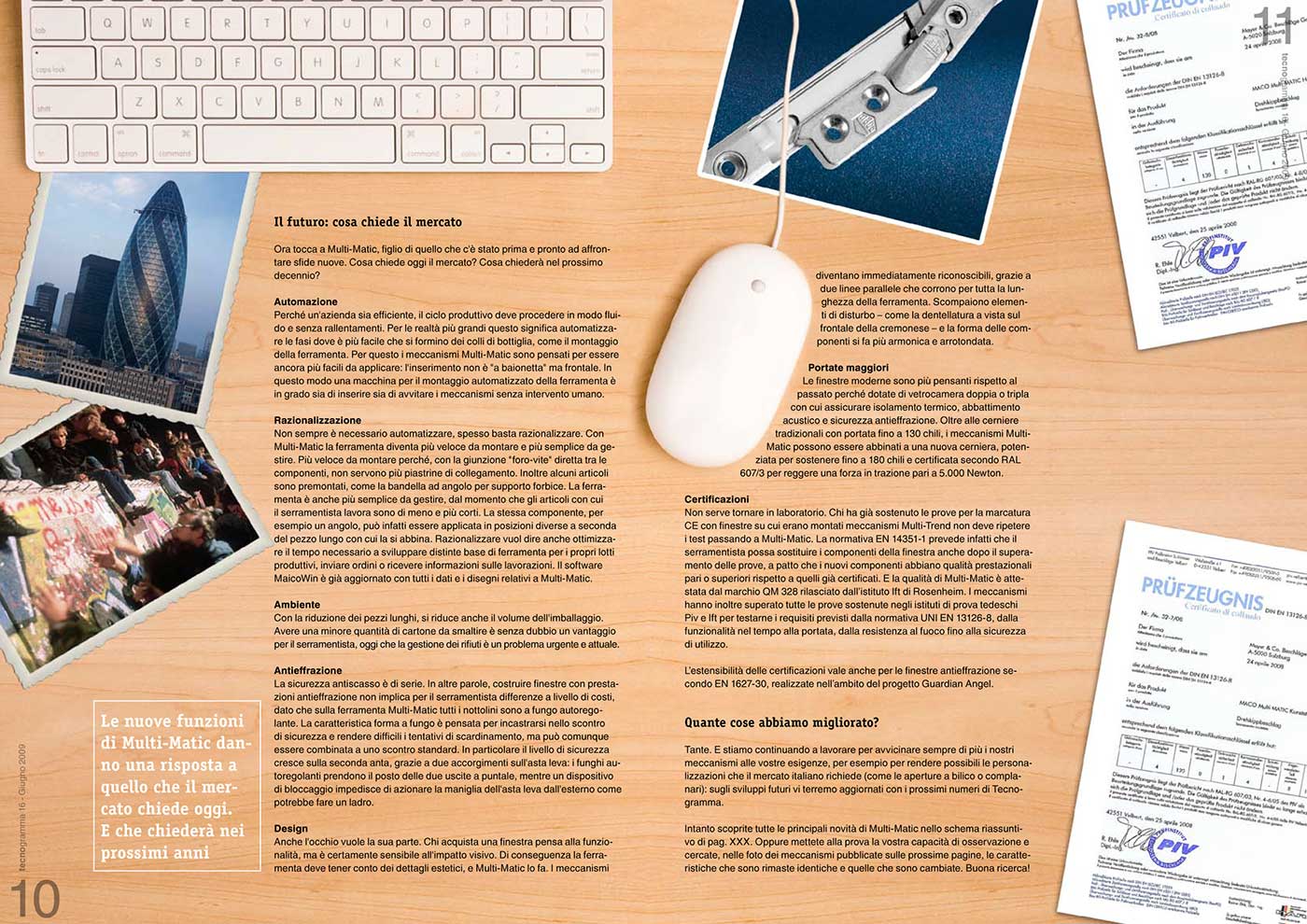
Revolution in some kind of way is the main theme on the third spread. We moved ahead in time and there is now to see an computer and a mouse. We are close to our present days and just like the fall of the wall in Berlin and the technically revolutionary architecture of Norman Foster the first photo of the new hardware is shown. The concept is now clear to everybody and the certificates for the new hardware are important for the reader and are mentioned in the text, so why not put them here, as some sheets of paper on a desk look quite natural.
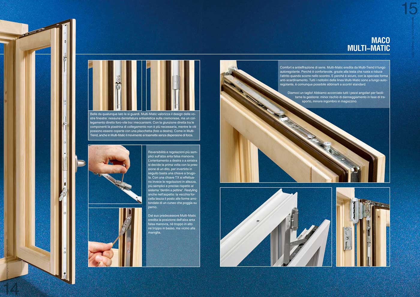
I just show here one showcase spreads to let you see how radical the cut between the introduction and the actual product presentation is. Every spread looks more or less (graphically speaking) the same. We have the background where you can see the window as a whole and details of the new enhancements.
And the lesson is
The importance of a good storyline is obvious to catch the attention of the reader. The layout and design can help telling this story and in combination with the text you can bring the message to the reader in a stronger way. Don't limit yourself even when the facts you have to deliver seem dull or not exciting. Setup a story and embed the facts. The reader will benefit and you will have more fun designing.


Comments (0)